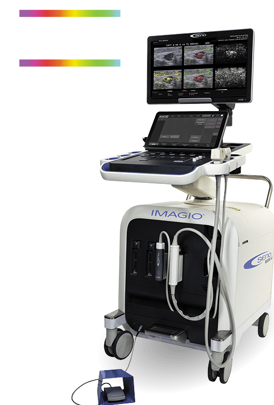
Introducing the Imagio® Breast Imaging System
The next evolution of breast cancer diagnostics
Imagio® offers a new diagnostic pathway with less financial and emotional burdens to the women who need it most.
Simplifying the complexity of diagnosing cancer
Despite the rapid advancement in breast imaging modalities, the current clinical pathway is inefficient, resulting in multiple procedures, inconclusive results, and a negative patient experience.
Imagio® represents the first real alternative providing achievable efficiency and diagnostic confidence with a simplified pathway to clinical results.

Imagio® offers a new diagnostic pathway with less financial and emotional burdens to the women who need it most.
Truth in Numbers with typical breast cancer screening
Percentage of false-positive breast biopsies3
Annual costs of false-positive breast biopsies1


Median wait time from abnormal mass to diagnosis2

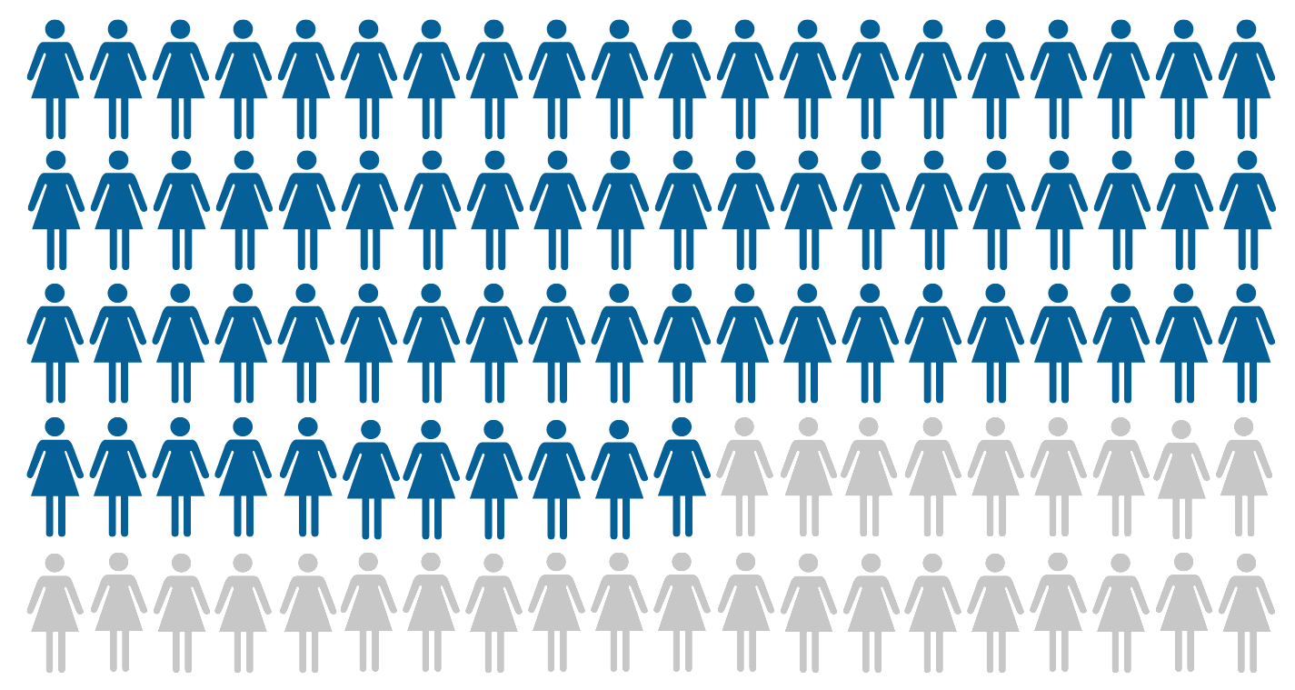
Percentage of women requiring 3 or more procedures1
Seno Medical Delivers a Medical Imaging Breakthrough
Meet a new imaging modality
Radiologists
Radiologist Benefits
- Earlier diagnosis of malignancy
- Confidence that you’re not missing a cancer
- Down-classifying BI-RADS on baseline
Staff
Staff Benefits
- Greater practice efficiency; fewer repeat exams and follow-ups
- Clinical decision support at point-of-care
- Simplified and streamlined scheduling
Patients
Patient Benefits
- Reduced stress, worry, and wait-times
- Reduces false positive biopsies
- Non-invasive and no ionizing radiation
Healthcare Systems
Healthcare Systems Benefits
- Increased capacity for screening
- Reduced time to treatment
- Improved profitability
Request a live demo
Our nationwide roadshow can bring Imagio® to your facility or you can start the conversation with a Seno rep today to get more details.
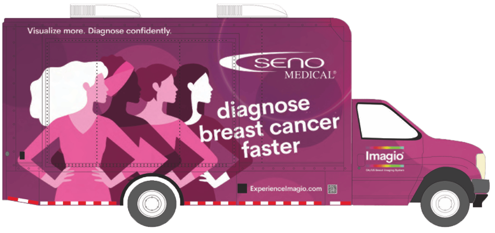
Scans across America
A simple
transition
World Class Training
Incorporating Imagio® into your workflow is similar to how you implemented tomosynthesis into your practice and includes training from one of the world’s leading breast ultrasound instructors.
A relief for patients
Studies show that the stress of waiting for biopsy results is indistinguishable from the same stress felt by patients actually diagnosed with cancer. With the Imagio® Breast Imaging System, you can get answers without needles, dyes, or X-rays, which means more women may avoid biopsy altogether to rule out cancer